There are tons of people who don't think twice about a glass of wine but resent every penny of a designated-driver fee or a taxi.
Wine comes out of countless small and mid-sized vineyards in different vintages every year, so apart from a handful of famous bottles, the reference points for comparing prices are relatively few and complicated. Whisky, by contrast, is more like an industrial product where the same SKU keeps getting released year after year. Anyway, unless it's a really famous wine, production cost typically lands somewhere between $10 and $30. If the cost is $20, retail distribution comes out to about $30, and you can expect a restaurant to sell it for around $60. That's the U.S. baseline; in Korea it seems like there's an extra 20–30% premium on top.
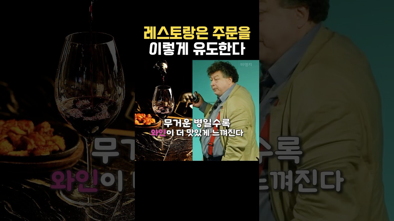
Consumers feel like they made the choice themselves, but they often miss how that menu of options was built in the first place. In reality, what they make is usually a guided choice. In marketing this is called "Choice Architecture." To sell the wines with the best margins, restaurants design the menu sheet carefully, hand the wine list to only one person at the table, and engineer a setup where the group has no choice but to drink together — naturally nudging the table toward a particular bottle. The consumer ends up thinking they picked it, but really they picked from an already-designed set of choices. The same principle applies to any business. Before worrying about what the customer will pick, design what you want them to pick. The one who designs the options is the one who walks away with the revenue. For example: an ordinary restaurant? Place a slightly less expensive item next to the most expensive one — the middle item then looks like "the sensible choice." A café? Set the small size at a high unit price, and design the large size to look like the better deal. Naturally the customer is guided to the higher-priced size.
https://www.youtube.com/shorts/e3nP8UfDMlc
